- Thread Author
- #1
Thought that these were interesting from the Uni Watch website
The GB Packers' "Cheesehead" helmet...lol.

The Chicago "Bearhead" helmet logo to replace the plain "C". Before we got a family color TV set ca 1968, I thought that the Bears' helmets and home unis were black, not dark navy blue:

The Minnesota Vikings' "Mascot " logo helmet:

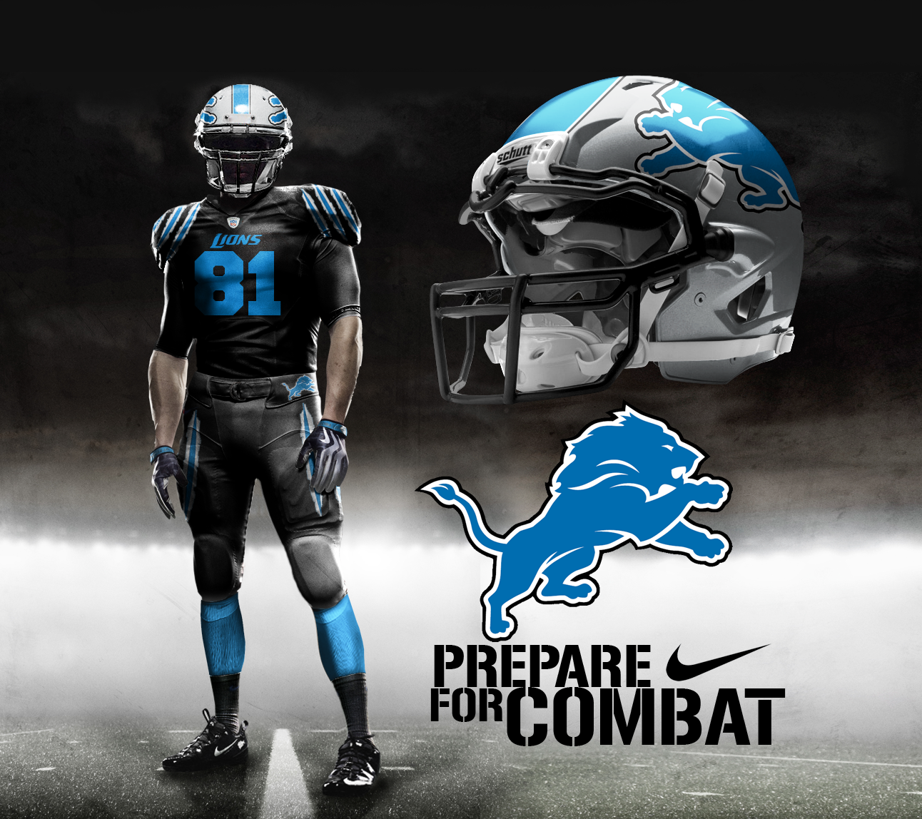
And last, but not least, two creations for the Detroit Lions, the first is a mashup of the Millen-era black jerseys with Honolulu blue numbers, but instead on a helmet:

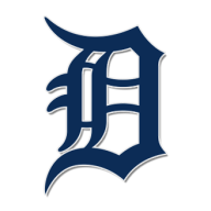
A copy"cat" approach to the Detroit Tigers' tiger passing through the Olde English D that was used by the club during the 90s, but instead of a tiger, the Lions' old "Bubbles" silhouette was used, on a gray (not silver) helmet but minus the black outline that was added, and w/o the more ferocious "muscular" white highlighting, jaws and eye that "improved " and updated "Bubbles" appearance.
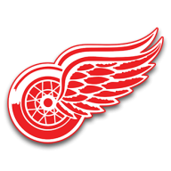
No...just NO!! ...as the Olde English D is proper only for the Tigers, the Red Wings have a somewhat more subdued version of the Olde English D as their alternate letter D to the Winged Wheel. The Lions would need to create an industrial-looking, perhaps block D as an alternate, if anything IMO. I was once completely in favor of getting rid of the Lion silhouette entirely, and return to their plain silver throwbacks that the players have worn from time to time, until they updated it:

Some of the other helmet designs for the other NFL teams are pretty good, and some are just awful, but I only included some of the NFCN creations.
The GB Packers' "Cheesehead" helmet...lol.
The Chicago "Bearhead" helmet logo to replace the plain "C". Before we got a family color TV set ca 1968, I thought that the Bears' helmets and home unis were black, not dark navy blue:
The Minnesota Vikings' "Mascot " logo helmet:
And last, but not least, two creations for the Detroit Lions, the first is a mashup of the Millen-era black jerseys with Honolulu blue numbers, but instead on a helmet:
A copy"cat" approach to the Detroit Tigers' tiger passing through the Olde English D that was used by the club during the 90s, but instead of a tiger, the Lions' old "Bubbles" silhouette was used, on a gray (not silver) helmet but minus the black outline that was added, and w/o the more ferocious "muscular" white highlighting, jaws and eye that "improved " and updated "Bubbles" appearance.
No...just NO!! ...as the Olde English D is proper only for the Tigers, the Red Wings have a somewhat more subdued version of the Olde English D as their alternate letter D to the Winged Wheel. The Lions would need to create an industrial-looking, perhaps block D as an alternate, if anything IMO. I was once completely in favor of getting rid of the Lion silhouette entirely, and return to their plain silver throwbacks that the players have worn from time to time, until they updated it:
Some of the other helmet designs for the other NFL teams are pretty good, and some are just awful, but I only included some of the NFCN creations.