Welcome to Detroit Sports Forum!

By joining our community, you'll be able to connect with fellow fans that live and breathe Detroit sports just like you!

Get Started
  • If you are no longer able to access your account since our recent switch from vBulletin to XenForo, you may need to reset your password via email. If you no longer have access to the email attached to your account, please fill out our contact form and we will assist you ASAP. Thanks for your continued support of DSF.

New Unis revealed

Monster

Forum Manager
Moderator
Joined
Aug 1, 2011
Messages
24,398
Detroit Lions
Detroit Tigers
Detroit Pistons
Detroit Red Wings
Michigan Wolverines
Sacramento Kings
Michigan Wolverines
Detroit Pistons


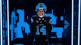
Wasn't expecting a lot, but the home blue look classic, the whites look really solid, and the alt-black with the blue helmets look awesome.
 
Love the home unis. Like the others. Prefer silver pants on the road over the Honolulu Blue. Like that the Lions have reverted to something close to the original Honolulu Blue hex code. Glad that the block numbers are back. Glad that the all-greys are gone.
 
I hate the blue pants with anything other than the blue jerseys. Blue on blue is nice. White on blue looks goofy and black on blue looks like a Frankenstein Madden uniform. Black on black, blue on blue, white on white, or any on silver should be the only combos we use.
 
Sun God
 

Attachments

  • 73375942007-240306-2024-uniforms-media-day-588.jpg
    73375942007-240306-2024-uniforms-media-day-588.jpg
    114.1 KB · Views: 11
Like:
  • Blue face masks
  • Return of block numbering
  • Removal of WCF from the sleeve
  • Everything about the black alternates.
Dislikes:
  • Words above the numbers (Lions, Detroit). Prefer the bigger numbers with no words.
  • It bothers me that for 'Lions' they use upper case for everything but the 'n'. I don't understand it.
  • No stripes on the pants. I don't dig the plain look of nothing but one color.
I think the non stripe pants are so they can mix and match them with different jerseys without it looking weird
 
I think the non stripe pants are so they can mix and match them with different jerseys without it looking weird
IMO the non-stripe pants look odd in any event. They look like undergarments to me.
 
Back
Top